What Is MicroCopy and How You Can Improve UX
Websites today have a lot of small details: buttons, search bars, breadcrumbs, forms, etc.’. But did you ever stop to think how these “small details” can make a big difference on your website? Improve your website’s SEO with MicroCopy in mind.
These small details, or more precisely – the text that comes with them, is called MicroCopy. MicroCopy is designed to help users on your website navigate, execute, and convert.
Designed to ease user anxiety, give and direct them to useful information, clarify and even to amuse (think SEO Easter eggs). These texts are not notable, on the contrary, they should be detectable – and still provide an excellent user experience. (Learn more about the importance of Findability vs Discoverability)
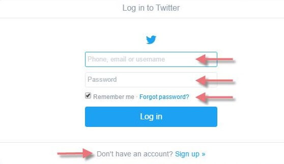
Twitter’s login window demonstrates how adding a few keywords can change the entire picture. These keywords make it clear what we have to write in every field and make it clear what we have to do if we have forgotten the password, and offer us to register if we don’t have an account :
What Does MicroCopy Have To Do With SEO Anyways?
SEO is about getting your site to the top of the search engine ranking page (SERPs). In the past, to succeed in this task, people used several methods that are no longer work today, such as keyword stuffing, and focusing on building backlinks. Today, Google is much more sophisticated, and it understands the user needs better than before, and that is why users experience is now consider one of the top priorities in website ranking factors.
MicroCopy does exactly that – it contributes significantly to user experience, in a way that even the small changes, like adding a few words to the field where the user needs to fill, can get you to a significant increase in conversions.
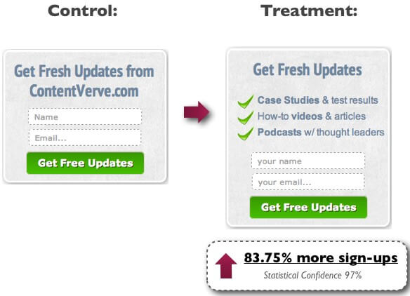
For example, Contentverve did a small change in their registration form: added three bullets that explain the benefits of being register to their newsletter. That led them to 83.75 increase in their newsletter registrations.
All the SEO in the world won’t help a site that is non user-friendly. If your users are having trouble navigating, or getting stuck on a form (passwords need a number, and a capital, but cant have +,-,$) or have too many fields to fill, and don’t understand the real purpose of clicking a specific CTA button – they will just leave your site.
6 MicroCopy Opportunities To Increase Your Conversions
Kissmetrics offers two good indicators, identifying opportunities to improve MicroCopy on your site:
- A low conversion rate element. Like a button for downloading a free manual.
- A high rate of user errors element. Like a registration form with fields that cause confusing errors.
Here is a list of 6 areas on your site that you can use to improve your MicroCopy:
CTA buttons.
Michael Aagaard says that instead of writing on a CTA button what the users need to do (the way), we should write what will the users get! (The value).
CTA buttons are a big opportunity and have huge potential to impact your conversion rates. While creating these buttons, we need to think about the questions that might come up with users while they are considering whether to click the button; and make sure that you text on submit buttons are answering these questions.
Opportunitymax gives some examples of questions: What is my motivation for clicking? What should I expect from the next screen or step? Am I sure I want to continue? How do I find _____?, Depending on the location of the site, page, and where the button appears and the action it serves.
On ETSY, the CTA button is very direct and effective:

Forms.
Forms that users need to fill can be very confusing sometimes and can make the users fill the wrong details in the wrong places. Moreover, sometimes they are too long or too invasive. Here are the principles you should keep in building forms:
- Providing clear instructions for filling fields
- Small amount of fields
- Minimum necessary information request ( is it that necessary for you to have the user phone, email, and address? )
- Clarifications on areas that can raise some questions ( “ we want to know when is your birthday so we can send you a voucher to your email on that day “ )
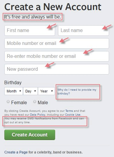
The Facebook registration form is a classic example of a great use of the MicroCopy:
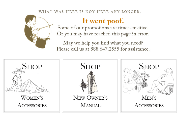
404 pages.
If a user sees a 404 page, it means they didn’t get what they were looking for. At that moment, a user can choose from two options: leave your site, or stay in and keep looking. Having good MicroCopy on a 404 page can be the difference of the user bouncing or continuing on.
MicroCopy of a 404 page should be breezy and entertaining, so the user will understand that it’s not his fault the page is not there anymore. It also should direct the user to a better page on the site that can be more relevant to him.
J.peterman does it just right. So simple, and very helpful
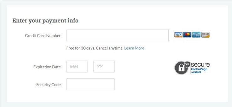
Payment info pages
Payment pages are what users see after they decide to purchase something on your website. Wouldn’t it be sad if they bounce off this page just before completing their purchase only because of they afraid that the site isn’t secure enough? Or maybe, they won’t be able to cancel the payment later or return the merchandise easily?
One approach by Moz is to make sure that the user fully understands, so they clarify it all in one simple box: free for 30 days, cancel anytime you want, a picture of all acceptable credit cards, and proof that the site is secure.
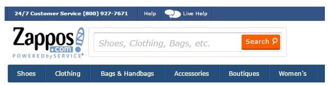
Search boxes
Adding a search box to your site is positive thinking, but what if the user is not quite sure what they are suppose to search for, or what kind of words they should use?
Adding suggestions into the search box can encourage the users to use the search option and help them to find easily what they’re looking.
Here is a classic example from Zappos:
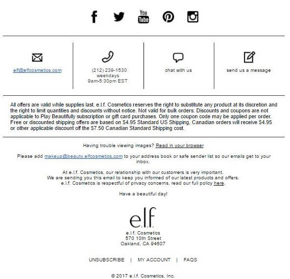
Email Marketing
Although email marketing is not part of your website, it has a significant role in your marketing efforts.
Email Marketing contains direct links to your website, so a good user experience with your website can start in their mail inbox.
It is important today to build and design emails that look exactly like a web page – with CTA buttons, registration forms, etc.’
A good marketing email is one that gives the readers concise and relevant information, providing answers to all the questions they didn’t even think of, and connecting them easily with the most relevant areas of the site, your social media properties, and of course – give them the option to remove themselves from the mailing list.
Here you can see the footer of one of e.l.f emails. You can see that they covered everything in it.
Conclusion
Using good MicroCopy is a win-win: users feel much more comfortable, and you are (hopefully) getting more conversions.
Although it requires investment (and you should also try A/B testing as well) the profit potential is enormous, so it is a particularly worthwhile SEO investment.
Overdrive Interactive is an SEO company in Boston that drives measurable ROI. Our search engine optimization programs not only drive natural search traffic – they connect prospects to high quality user experiences that encourage desired behavior. Our SEO services and the resulting search engine presence connects visitors to content that satisfies their needs. As an award-winning Boston SEO firm, we are passionate about your success!