


![]() If MySpace were a worn, rusted, and underperforming engine, it just received a long overdue tune-up. Wednesday marked the introduction of a completely redesigned user experience that represents the company’s most recent and drastic attempt to revitalize the ailing social networking site. Rollouts began two days ago and will continue into November. With a new design and strategy, MySpace shows glimmers of hope, but with only 61 Million users (and plummeting), are these improvements too little too late? Here’s the good, the bad, and the ugly of MySpace’s current circumstances:
If MySpace were a worn, rusted, and underperforming engine, it just received a long overdue tune-up. Wednesday marked the introduction of a completely redesigned user experience that represents the company’s most recent and drastic attempt to revitalize the ailing social networking site. Rollouts began two days ago and will continue into November. With a new design and strategy, MySpace shows glimmers of hope, but with only 61 Million users (and plummeting), are these improvements too little too late? Here’s the good, the bad, and the ugly of MySpace’s current circumstances:
THE GOOD
Redefined Focus – MySpace has dumped its original goal of providing “a place for friends,” in favor of the more refined goal of becoming “the leading entertainment destination that is socially powered by the passions of fans and curators.” By redefining its focus, MySpace has strategically abandoned it’s once size fits all mentality for a more targeted approach. Rather than attempting to provide something for everyone, the company can now throw everything it’s got at the 13 to 35-year-old demographic. Not to mention, by doing so, MySpace differentiates itself from other social networks, especially the big man on campus, Facebook.
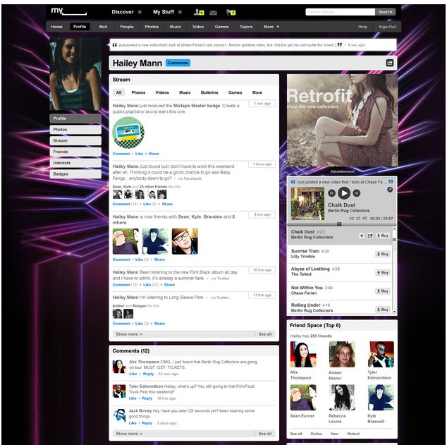
New Design – If the old MySpace were a Ford Pinto, the new site is an Audi R8. It’s clean, modern, and hip. The novel design makes use of a modular/block format that reduces clutter and results in pleasing aesthetics. The visual overhaul is long overdue and greatly improves on previous iterations.
Unique Features – Topic and Celebrity Hub Pages are two fresh features that reinforce the site’s new focus on entertainment. Topic Pages help collect and display entertainment information around specific topics. For example, imagine several news feeds dedicated to your favorite shows. Dancing with the Stars, anyone? In addition, Celebrity Hub Pages are a great way to stay up to date with all your favorite celebrities.
THE BAD
New Design – While the new design may be a welcome change for some, it may become overwhelming for others. In the past, even some of the most subtle Facebook design changes have enraged users. MySpace’s redesign is about as subtle as a sledgehammer… It will be interesting to see how users respond.
Competition – While MySpace stewed in stagnation the past few years, the social networking landscape grew fierce. Facebook, with over 500 million users, has claimed the title of King of the Hill. While on the other hand, Twitter with over 190 million users, recently surpassed MySpace in monthly traffic. While MySpace slumbered, its rivals benefited. Nowadays, many online users’ demands are met by either Facebook or Twitter. Will internet users find additional value in MySpace?
Stigma – One of MySpace’s biggest challenges will be shedding its unfavorable stigma. This infographic says it best: For those that use MySpace it “destroys any chance of credibility. You will be perceived as having the mindset of a middle schooler, and probably do.” This will be a tough perception to shake.
THE UGLY

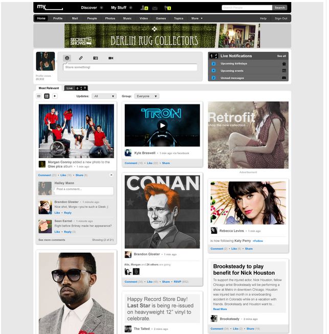
Homepage – While visually appealing, the new homepage has a lot going on and comes off as a bit busy. An interesting choice of format considering the homepage makes the first impression with prospects.
MySpace Logo Video – The MySpace Logo Video is just plain weird. You lost me at the teal mustached monster…
MySpace is utterly and completely the underdog in this fight. The new design is much improved and the focus has been tweaked for the better, but at this point it may not even matter… Is there hope? We shall see. In the end, a tuned-up engine may breathe new life into a car, but it can only do so much when the body is in disrepair.
