From Data to Decisions: Building a Modern Marketing Analytics Engine

In our last post, we explored how to design dashboards that are clear, intuitive, and widely adopted. Those dashboards are now your windows into performance — but the real work begins when you decide what to do with what you see. A dashboard full of KPIs, trend lines, and performance comparisons can be impressive, but without the discipline to interpret those visuals and turn them into concrete actions, their value remains unrealized.
This section is about bridging that gap. We’ll walk through how to treat your visuals not as static summaries, but as dynamic prompts for investigation, hypothesis development, and decision-making. You’ll learn how to separate meaningful trends from background noise, account for data limitations, and build a process that ensures insights don’t just sit on a screen — they translate into measurable impact.
Moving from Passive Viewing to Active Decision-Making
Many teams treat dashboards as scoreboards — they look, note whether things are “up” or “down,” and move on. But the true power of your BI engine is unlocked when dashboards are treated as operational tools, not static reports. Moving from passive viewing to active decision-making means making the review process intentional and embedding it into the rhythm of your marketing operations.
When you see a change in performance, it’s not enough to acknowledge it — you must connect it to potential causes, assess whether it matters, and determine the next steps. Over time, this approach builds an organizational culture where data isn’t just reviewed but acted on, leading to faster and more confident decisions.
Key principles for making this shift:
- Adopt an investigative mindset — treat every unusual movement in a metric as a starting point for inquiry, not the end of a conversation.
- Link insights to objectives — focus your interpretation on metrics tied directly to strategic business goals rather than vanity measures.
- Embed follow-up into your process — close every review meeting with specific next steps, even if that step is simply to “hold steady and monitor.”
Turning Charts into Questions
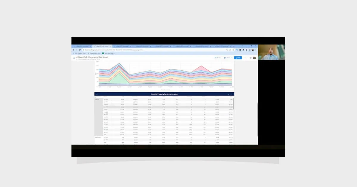
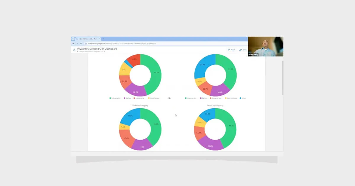
Charts are often mistakenly treated as conclusions — a visual “answer” to performance questions. In reality, they are prompts for deeper inquiry. The insight doesn’t live in the bar chart or line graph itself; it emerges from the questions you ask when something changes.
For example, if your CTR has dropped, don’t immediately adjust budgets or swap creatives. First investigate where and how that drop is occurring. Is it across all campaigns, or isolated to a specific audience or channel? Did any creative assets, bid strategies, or targeting parameters change in the period leading up to the decline? Could external factors — such as seasonality, competitor activity, or shifts in consumer behavior — be influencing results?
An example approach to chart-driven inquiry:
- Spot a metric change in a dashboard visualization.
- Break the metric down by campaign, audience, or region to pinpoint where it’s happening.
- Compare against historical trends to determine whether it’s truly abnormal.
- Consider internal and external factors that could explain the shift.
Separating Signal from Noise
One of the most important skills in data interpretation is knowing which changes matter and which don’t. Overreacting to noise can lead to wasted resources, unnecessary campaign disruption, and poor decision-making. To avoid this, establish a filtering process before making changes.
A signal is a change that’s meaningful, sustained, and tied to underlying factors you can influence. Noise might be short-term fluctuations caused by random variance, incomplete data, or temporary market anomalies. Recognizing the difference keeps your team focused on actions that will deliver lasting impact.
Ways to filter signal from noise:
- Compare current performance to historical averages and known seasonal patterns.
- Check for statistical significance or confidence intervals to confirm changes aren’t random.
- Ensure data is fresh and complete before reacting.
- Look for corroborating movements in related metrics to strengthen the case for action.
Building and Testing Hypotheses
Once you believe you’ve identified a signal, the next step is to translate it into a testable hypothesis. This turns interpretation into something measurable and verifiable, reducing the risk of arbitrary changes.
For example, if CTR in your prospecting campaigns has declined, your hypothesis might be: “CTR decreased due to creative fatigue from overexposed ads.” You can then design an experiment where you introduce new creatives to half of your impressions while keeping the other half unchanged.
A structured hypothesis-testing process:
- Define the observed change and your suspected cause.
- Determine the adjustment you’ll make to test that cause.
- Identify a control group or comparison period.
- Measure results and decide whether to scale, modify, or roll back the change.
Accounting for Attribution Gaps and Data Limitations
Even the cleanest dashboards are built on imperfect data. Privacy restrictions, tracking limitations, and platform differences mean your view is never 100% complete. Ignoring these limitations can lead to overconfidence in your conclusions.
Instead, make attribution gaps and data caveats part of your interpretation process. This context helps you weigh decisions appropriately and avoid overreacting to incomplete views of performance.
Best practices for working with imperfect data:
- Cross-validate key findings using multiple data sources when possible.
- Combine modeled data with observed metrics to fill known gaps.
- Document limitations within dashboards or reports so all stakeholders are aligned before acting.
Empowering Teams to Act on Insights
Interpretation only matters if it’s followed by action. The best organizations ensure clear ownership of next steps, timelines for implementation, and feedback loops for measuring results. Without these elements, valuable insights often fade into meeting notes with no meaningful impact.
When roles and responsibilities are defined, and there is a culture of accountability, decisions move from conversation to execution far more efficiently.
Steps to drive accountability:
- Assign ownership for implementing specific changes directly from dashboard reviews.
- Establish timelines for when adjustments will be made and when results will be assessed.
- Share outcomes with the broader team to close the loop and reinforce the value of acting on insights.
Practical Example: Turning Insight into Market Strategy
Imagine your regional performance dashboard shows a steady decline in ROAS for one geography over four weeks, while other regions hold steady. A surface-level reaction might be to pull budget from that market entirely. A deeper interpretation process, however, might reveal that a competitor launched a high-discount campaign during that same period, diverting attention from your ads.
Rather than retreating, you decide to adjust your local media mix, shift more budget to channels that have maintained performance, and refresh creative to highlight unique value propositions. Two weeks later, ROAS begins to rebound — a direct result of interpreting the data in context and acting strategically.
Final Thoughts
Interpreting and acting on data is where your marketing intelligence engine proves its worth. It requires curiosity to ask the right questions, discipline to separate signal from noise, and structured processes to ensure insights lead to action. When done well, this turns dashboards from static snapshots into engines of continuous improvement.
In Section 7, we’ll explore how to sustain this momentum — keeping your BI engine healthy, scalable, and adaptable for the long term.
Catch up on the entire From Data to Decision series here.


From Data to Decisions: Building a Modern Marketing Analytics Engine
Download the guide to:
In our last post, we explored how to design dashboards that are clear, intuitive, and widely adopted. Those dashboards are now your windows into performance — but the real work begins when you decide what to do with what you see. A dashboard full of KPIs, trend lines, and performance comparisons can be impressive, but without the discipline to interpret those visuals and turn them into concrete actions, their value remains unrealized.
This section is about bridging that gap. We’ll walk through how to treat your visuals not as static summaries, but as dynamic prompts for investigation, hypothesis development, and decision-making. You’ll learn how to separate meaningful trends from background noise, account for data limitations, and build a process that ensures insights don’t just sit on a screen — they translate into measurable impact.
Moving from Passive Viewing to Active Decision-Making
Many teams treat dashboards as scoreboards — they look, note whether things are “up” or “down,” and move on. But the true power of your BI engine is unlocked when dashboards are treated as operational tools, not static reports. Moving from passive viewing to active decision-making means making the review process intentional and embedding it into the rhythm of your marketing operations.
When you see a change in performance, it’s not enough to acknowledge it — you must connect it to potential causes, assess whether it matters, and determine the next steps. Over time, this approach builds an organizational culture where data isn’t just reviewed but acted on, leading to faster and more confident decisions.
Key principles for making this shift:
- Adopt an investigative mindset — treat every unusual movement in a metric as a starting point for inquiry, not the end of a conversation.
- Link insights to objectives — focus your interpretation on metrics tied directly to strategic business goals rather than vanity measures.
- Embed follow-up into your process — close every review meeting with specific next steps, even if that step is simply to “hold steady and monitor.”
Turning Charts into Questions
Charts are often mistakenly treated as conclusions — a visual “answer” to performance questions. In reality, they are prompts for deeper inquiry. The insight doesn’t live in the bar chart or line graph itself; it emerges from the questions you ask when something changes.
For example, if your CTR has dropped, don’t immediately adjust budgets or swap creatives. First investigate where and how that drop is occurring. Is it across all campaigns, or isolated to a specific audience or channel? Did any creative assets, bid strategies, or targeting parameters change in the period leading up to the decline? Could external factors — such as seasonality, competitor activity, or shifts in consumer behavior — be influencing results?
An example approach to chart-driven inquiry:
- Spot a metric change in a dashboard visualization.
- Break the metric down by campaign, audience, or region to pinpoint where it’s happening.
- Compare against historical trends to determine whether it’s truly abnormal.
- Consider internal and external factors that could explain the shift.
Separating Signal from Noise
One of the most important skills in data interpretation is knowing which changes matter and which don’t. Overreacting to noise can lead to wasted resources, unnecessary campaign disruption, and poor decision-making. To avoid this, establish a filtering process before making changes.
A signal is a change that’s meaningful, sustained, and tied to underlying factors you can influence. Noise might be short-term fluctuations caused by random variance, incomplete data, or temporary market anomalies. Recognizing the difference keeps your team focused on actions that will deliver lasting impact.
Ways to filter signal from noise:
- Compare current performance to historical averages and known seasonal patterns.
- Check for statistical significance or confidence intervals to confirm changes aren’t random.
- Ensure data is fresh and complete before reacting.
- Look for corroborating movements in related metrics to strengthen the case for action.
Building and Testing Hypotheses
Once you believe you’ve identified a signal, the next step is to translate it into a testable hypothesis. This turns interpretation into something measurable and verifiable, reducing the risk of arbitrary changes.
For example, if CTR in your prospecting campaigns has declined, your hypothesis might be: “CTR decreased due to creative fatigue from overexposed ads.” You can then design an experiment where you introduce new creatives to half of your impressions while keeping the other half unchanged.
A structured hypothesis-testing process:
- Define the observed change and your suspected cause.
- Determine the adjustment you’ll make to test that cause.
- Identify a control group or comparison period.
- Measure results and decide whether to scale, modify, or roll back the change.
Accounting for Attribution Gaps and Data Limitations
Even the cleanest dashboards are built on imperfect data. Privacy restrictions, tracking limitations, and platform differences mean your view is never 100% complete. Ignoring these limitations can lead to overconfidence in your conclusions.
Instead, make attribution gaps and data caveats part of your interpretation process. This context helps you weigh decisions appropriately and avoid overreacting to incomplete views of performance.
Best practices for working with imperfect data:
- Cross-validate key findings using multiple data sources when possible.
- Combine modeled data with observed metrics to fill known gaps.
- Document limitations within dashboards or reports so all stakeholders are aligned before acting.
Empowering Teams to Act on Insights
Interpretation only matters if it’s followed by action. The best organizations ensure clear ownership of next steps, timelines for implementation, and feedback loops for measuring results. Without these elements, valuable insights often fade into meeting notes with no meaningful impact.
When roles and responsibilities are defined, and there is a culture of accountability, decisions move from conversation to execution far more efficiently.
Steps to drive accountability:
- Assign ownership for implementing specific changes directly from dashboard reviews.
- Establish timelines for when adjustments will be made and when results will be assessed.
- Share outcomes with the broader team to close the loop and reinforce the value of acting on insights.
Practical Example: Turning Insight into Market Strategy
Imagine your regional performance dashboard shows a steady decline in ROAS for one geography over four weeks, while other regions hold steady. A surface-level reaction might be to pull budget from that market entirely. A deeper interpretation process, however, might reveal that a competitor launched a high-discount campaign during that same period, diverting attention from your ads.
Rather than retreating, you decide to adjust your local media mix, shift more budget to channels that have maintained performance, and refresh creative to highlight unique value propositions. Two weeks later, ROAS begins to rebound — a direct result of interpreting the data in context and acting strategically.
Final Thoughts
Interpreting and acting on data is where your marketing intelligence engine proves its worth. It requires curiosity to ask the right questions, discipline to separate signal from noise, and structured processes to ensure insights lead to action. When done well, this turns dashboards from static snapshots into engines of continuous improvement.
In Section 7, we’ll explore how to sustain this momentum — keeping your BI engine healthy, scalable, and adaptable for the long term.
Catch up on the entire From Data to Decision series here.
.webp)
From Data to Decisions: Building a Modern Marketing Analytics Engine
Download the guide to:
In our last post, we explored how to design dashboards that are clear, intuitive, and widely adopted. Those dashboards are now your windows into performance — but the real work begins when you decide what to do with what you see. A dashboard full of KPIs, trend lines, and performance comparisons can be impressive, but without the discipline to interpret those visuals and turn them into concrete actions, their value remains unrealized.
This section is about bridging that gap. We’ll walk through how to treat your visuals not as static summaries, but as dynamic prompts for investigation, hypothesis development, and decision-making. You’ll learn how to separate meaningful trends from background noise, account for data limitations, and build a process that ensures insights don’t just sit on a screen — they translate into measurable impact.
Moving from Passive Viewing to Active Decision-Making
Many teams treat dashboards as scoreboards — they look, note whether things are “up” or “down,” and move on. But the true power of your BI engine is unlocked when dashboards are treated as operational tools, not static reports. Moving from passive viewing to active decision-making means making the review process intentional and embedding it into the rhythm of your marketing operations.
When you see a change in performance, it’s not enough to acknowledge it — you must connect it to potential causes, assess whether it matters, and determine the next steps. Over time, this approach builds an organizational culture where data isn’t just reviewed but acted on, leading to faster and more confident decisions.
Key principles for making this shift:
- Adopt an investigative mindset — treat every unusual movement in a metric as a starting point for inquiry, not the end of a conversation.
- Link insights to objectives — focus your interpretation on metrics tied directly to strategic business goals rather than vanity measures.
- Embed follow-up into your process — close every review meeting with specific next steps, even if that step is simply to “hold steady and monitor.”
Turning Charts into Questions
Charts are often mistakenly treated as conclusions — a visual “answer” to performance questions. In reality, they are prompts for deeper inquiry. The insight doesn’t live in the bar chart or line graph itself; it emerges from the questions you ask when something changes.
For example, if your CTR has dropped, don’t immediately adjust budgets or swap creatives. First investigate where and how that drop is occurring. Is it across all campaigns, or isolated to a specific audience or channel? Did any creative assets, bid strategies, or targeting parameters change in the period leading up to the decline? Could external factors — such as seasonality, competitor activity, or shifts in consumer behavior — be influencing results?
An example approach to chart-driven inquiry:
- Spot a metric change in a dashboard visualization.
- Break the metric down by campaign, audience, or region to pinpoint where it’s happening.
- Compare against historical trends to determine whether it’s truly abnormal.
- Consider internal and external factors that could explain the shift.
Separating Signal from Noise
One of the most important skills in data interpretation is knowing which changes matter and which don’t. Overreacting to noise can lead to wasted resources, unnecessary campaign disruption, and poor decision-making. To avoid this, establish a filtering process before making changes.
A signal is a change that’s meaningful, sustained, and tied to underlying factors you can influence. Noise might be short-term fluctuations caused by random variance, incomplete data, or temporary market anomalies. Recognizing the difference keeps your team focused on actions that will deliver lasting impact.
Ways to filter signal from noise:
- Compare current performance to historical averages and known seasonal patterns.
- Check for statistical significance or confidence intervals to confirm changes aren’t random.
- Ensure data is fresh and complete before reacting.
- Look for corroborating movements in related metrics to strengthen the case for action.
Building and Testing Hypotheses
Once you believe you’ve identified a signal, the next step is to translate it into a testable hypothesis. This turns interpretation into something measurable and verifiable, reducing the risk of arbitrary changes.
For example, if CTR in your prospecting campaigns has declined, your hypothesis might be: “CTR decreased due to creative fatigue from overexposed ads.” You can then design an experiment where you introduce new creatives to half of your impressions while keeping the other half unchanged.
A structured hypothesis-testing process:
- Define the observed change and your suspected cause.
- Determine the adjustment you’ll make to test that cause.
- Identify a control group or comparison period.
- Measure results and decide whether to scale, modify, or roll back the change.
Accounting for Attribution Gaps and Data Limitations
Even the cleanest dashboards are built on imperfect data. Privacy restrictions, tracking limitations, and platform differences mean your view is never 100% complete. Ignoring these limitations can lead to overconfidence in your conclusions.
Instead, make attribution gaps and data caveats part of your interpretation process. This context helps you weigh decisions appropriately and avoid overreacting to incomplete views of performance.
Best practices for working with imperfect data:
- Cross-validate key findings using multiple data sources when possible.
- Combine modeled data with observed metrics to fill known gaps.
- Document limitations within dashboards or reports so all stakeholders are aligned before acting.
Empowering Teams to Act on Insights
Interpretation only matters if it’s followed by action. The best organizations ensure clear ownership of next steps, timelines for implementation, and feedback loops for measuring results. Without these elements, valuable insights often fade into meeting notes with no meaningful impact.
When roles and responsibilities are defined, and there is a culture of accountability, decisions move from conversation to execution far more efficiently.
Steps to drive accountability:
- Assign ownership for implementing specific changes directly from dashboard reviews.
- Establish timelines for when adjustments will be made and when results will be assessed.
- Share outcomes with the broader team to close the loop and reinforce the value of acting on insights.
Practical Example: Turning Insight into Market Strategy
Imagine your regional performance dashboard shows a steady decline in ROAS for one geography over four weeks, while other regions hold steady. A surface-level reaction might be to pull budget from that market entirely. A deeper interpretation process, however, might reveal that a competitor launched a high-discount campaign during that same period, diverting attention from your ads.
Rather than retreating, you decide to adjust your local media mix, shift more budget to channels that have maintained performance, and refresh creative to highlight unique value propositions. Two weeks later, ROAS begins to rebound — a direct result of interpreting the data in context and acting strategically.
Final Thoughts
Interpreting and acting on data is where your marketing intelligence engine proves its worth. It requires curiosity to ask the right questions, discipline to separate signal from noise, and structured processes to ensure insights lead to action. When done well, this turns dashboards from static snapshots into engines of continuous improvement.
In Section 7, we’ll explore how to sustain this momentum — keeping your BI engine healthy, scalable, and adaptable for the long term.
Catch up on the entire From Data to Decision series here.
From Data to Decisions: Building a Modern Marketing Analytics Engine
Key Insights From Our Research
In our last post, we explored how to design dashboards that are clear, intuitive, and widely adopted. Those dashboards are now your windows into performance — but the real work begins when you decide what to do with what you see. A dashboard full of KPIs, trend lines, and performance comparisons can be impressive, but without the discipline to interpret those visuals and turn them into concrete actions, their value remains unrealized.
This section is about bridging that gap. We’ll walk through how to treat your visuals not as static summaries, but as dynamic prompts for investigation, hypothesis development, and decision-making. You’ll learn how to separate meaningful trends from background noise, account for data limitations, and build a process that ensures insights don’t just sit on a screen — they translate into measurable impact.
Moving from Passive Viewing to Active Decision-Making
Many teams treat dashboards as scoreboards — they look, note whether things are “up” or “down,” and move on. But the true power of your BI engine is unlocked when dashboards are treated as operational tools, not static reports. Moving from passive viewing to active decision-making means making the review process intentional and embedding it into the rhythm of your marketing operations.
When you see a change in performance, it’s not enough to acknowledge it — you must connect it to potential causes, assess whether it matters, and determine the next steps. Over time, this approach builds an organizational culture where data isn’t just reviewed but acted on, leading to faster and more confident decisions.
Key principles for making this shift:
- Adopt an investigative mindset — treat every unusual movement in a metric as a starting point for inquiry, not the end of a conversation.
- Link insights to objectives — focus your interpretation on metrics tied directly to strategic business goals rather than vanity measures.
- Embed follow-up into your process — close every review meeting with specific next steps, even if that step is simply to “hold steady and monitor.”
Turning Charts into Questions
Charts are often mistakenly treated as conclusions — a visual “answer” to performance questions. In reality, they are prompts for deeper inquiry. The insight doesn’t live in the bar chart or line graph itself; it emerges from the questions you ask when something changes.
For example, if your CTR has dropped, don’t immediately adjust budgets or swap creatives. First investigate where and how that drop is occurring. Is it across all campaigns, or isolated to a specific audience or channel? Did any creative assets, bid strategies, or targeting parameters change in the period leading up to the decline? Could external factors — such as seasonality, competitor activity, or shifts in consumer behavior — be influencing results?
An example approach to chart-driven inquiry:
- Spot a metric change in a dashboard visualization.
- Break the metric down by campaign, audience, or region to pinpoint where it’s happening.
- Compare against historical trends to determine whether it’s truly abnormal.
- Consider internal and external factors that could explain the shift.
Separating Signal from Noise
One of the most important skills in data interpretation is knowing which changes matter and which don’t. Overreacting to noise can lead to wasted resources, unnecessary campaign disruption, and poor decision-making. To avoid this, establish a filtering process before making changes.
A signal is a change that’s meaningful, sustained, and tied to underlying factors you can influence. Noise might be short-term fluctuations caused by random variance, incomplete data, or temporary market anomalies. Recognizing the difference keeps your team focused on actions that will deliver lasting impact.
Ways to filter signal from noise:
- Compare current performance to historical averages and known seasonal patterns.
- Check for statistical significance or confidence intervals to confirm changes aren’t random.
- Ensure data is fresh and complete before reacting.
- Look for corroborating movements in related metrics to strengthen the case for action.
Building and Testing Hypotheses
Once you believe you’ve identified a signal, the next step is to translate it into a testable hypothesis. This turns interpretation into something measurable and verifiable, reducing the risk of arbitrary changes.
For example, if CTR in your prospecting campaigns has declined, your hypothesis might be: “CTR decreased due to creative fatigue from overexposed ads.” You can then design an experiment where you introduce new creatives to half of your impressions while keeping the other half unchanged.
A structured hypothesis-testing process:
- Define the observed change and your suspected cause.
- Determine the adjustment you’ll make to test that cause.
- Identify a control group or comparison period.
- Measure results and decide whether to scale, modify, or roll back the change.
Accounting for Attribution Gaps and Data Limitations
Even the cleanest dashboards are built on imperfect data. Privacy restrictions, tracking limitations, and platform differences mean your view is never 100% complete. Ignoring these limitations can lead to overconfidence in your conclusions.
Instead, make attribution gaps and data caveats part of your interpretation process. This context helps you weigh decisions appropriately and avoid overreacting to incomplete views of performance.
Best practices for working with imperfect data:
- Cross-validate key findings using multiple data sources when possible.
- Combine modeled data with observed metrics to fill known gaps.
- Document limitations within dashboards or reports so all stakeholders are aligned before acting.
Empowering Teams to Act on Insights
Interpretation only matters if it’s followed by action. The best organizations ensure clear ownership of next steps, timelines for implementation, and feedback loops for measuring results. Without these elements, valuable insights often fade into meeting notes with no meaningful impact.
When roles and responsibilities are defined, and there is a culture of accountability, decisions move from conversation to execution far more efficiently.
Steps to drive accountability:
- Assign ownership for implementing specific changes directly from dashboard reviews.
- Establish timelines for when adjustments will be made and when results will be assessed.
- Share outcomes with the broader team to close the loop and reinforce the value of acting on insights.
Practical Example: Turning Insight into Market Strategy
Imagine your regional performance dashboard shows a steady decline in ROAS for one geography over four weeks, while other regions hold steady. A surface-level reaction might be to pull budget from that market entirely. A deeper interpretation process, however, might reveal that a competitor launched a high-discount campaign during that same period, diverting attention from your ads.
Rather than retreating, you decide to adjust your local media mix, shift more budget to channels that have maintained performance, and refresh creative to highlight unique value propositions. Two weeks later, ROAS begins to rebound — a direct result of interpreting the data in context and acting strategically.
Final Thoughts
Interpreting and acting on data is where your marketing intelligence engine proves its worth. It requires curiosity to ask the right questions, discipline to separate signal from noise, and structured processes to ensure insights lead to action. When done well, this turns dashboards from static snapshots into engines of continuous improvement.
In Section 7, we’ll explore how to sustain this momentum — keeping your BI engine healthy, scalable, and adaptable for the long term.
Catch up on the entire From Data to Decision series here.
From Data to Decisions: Building a Modern Marketing Analytics Engine
Get the Complete Whitepaper
From Data to Decisions: Building a Modern Marketing Analytics Engine
In our last post, we explored how to design dashboards that are clear, intuitive, and widely adopted. Those dashboards are now your windows into performance — but the real work begins when you decide what to do with what you see. A dashboard full of KPIs, trend lines, and performance comparisons can be impressive, but without the discipline to interpret those visuals and turn them into concrete actions, their value remains unrealized.
This section is about bridging that gap. We’ll walk through how to treat your visuals not as static summaries, but as dynamic prompts for investigation, hypothesis development, and decision-making. You’ll learn how to separate meaningful trends from background noise, account for data limitations, and build a process that ensures insights don’t just sit on a screen — they translate into measurable impact.
Moving from Passive Viewing to Active Decision-Making
Many teams treat dashboards as scoreboards — they look, note whether things are “up” or “down,” and move on. But the true power of your BI engine is unlocked when dashboards are treated as operational tools, not static reports. Moving from passive viewing to active decision-making means making the review process intentional and embedding it into the rhythm of your marketing operations.
When you see a change in performance, it’s not enough to acknowledge it — you must connect it to potential causes, assess whether it matters, and determine the next steps. Over time, this approach builds an organizational culture where data isn’t just reviewed but acted on, leading to faster and more confident decisions.
Key principles for making this shift:
- Adopt an investigative mindset — treat every unusual movement in a metric as a starting point for inquiry, not the end of a conversation.
- Link insights to objectives — focus your interpretation on metrics tied directly to strategic business goals rather than vanity measures.
- Embed follow-up into your process — close every review meeting with specific next steps, even if that step is simply to “hold steady and monitor.”
Turning Charts into Questions
Charts are often mistakenly treated as conclusions — a visual “answer” to performance questions. In reality, they are prompts for deeper inquiry. The insight doesn’t live in the bar chart or line graph itself; it emerges from the questions you ask when something changes.
For example, if your CTR has dropped, don’t immediately adjust budgets or swap creatives. First investigate where and how that drop is occurring. Is it across all campaigns, or isolated to a specific audience or channel? Did any creative assets, bid strategies, or targeting parameters change in the period leading up to the decline? Could external factors — such as seasonality, competitor activity, or shifts in consumer behavior — be influencing results?
An example approach to chart-driven inquiry:
- Spot a metric change in a dashboard visualization.
- Break the metric down by campaign, audience, or region to pinpoint where it’s happening.
- Compare against historical trends to determine whether it’s truly abnormal.
- Consider internal and external factors that could explain the shift.
Separating Signal from Noise
One of the most important skills in data interpretation is knowing which changes matter and which don’t. Overreacting to noise can lead to wasted resources, unnecessary campaign disruption, and poor decision-making. To avoid this, establish a filtering process before making changes.
A signal is a change that’s meaningful, sustained, and tied to underlying factors you can influence. Noise might be short-term fluctuations caused by random variance, incomplete data, or temporary market anomalies. Recognizing the difference keeps your team focused on actions that will deliver lasting impact.
Ways to filter signal from noise:
- Compare current performance to historical averages and known seasonal patterns.
- Check for statistical significance or confidence intervals to confirm changes aren’t random.
- Ensure data is fresh and complete before reacting.
- Look for corroborating movements in related metrics to strengthen the case for action.
Building and Testing Hypotheses
Once you believe you’ve identified a signal, the next step is to translate it into a testable hypothesis. This turns interpretation into something measurable and verifiable, reducing the risk of arbitrary changes.
For example, if CTR in your prospecting campaigns has declined, your hypothesis might be: “CTR decreased due to creative fatigue from overexposed ads.” You can then design an experiment where you introduce new creatives to half of your impressions while keeping the other half unchanged.
A structured hypothesis-testing process:
- Define the observed change and your suspected cause.
- Determine the adjustment you’ll make to test that cause.
- Identify a control group or comparison period.
- Measure results and decide whether to scale, modify, or roll back the change.
Accounting for Attribution Gaps and Data Limitations
Even the cleanest dashboards are built on imperfect data. Privacy restrictions, tracking limitations, and platform differences mean your view is never 100% complete. Ignoring these limitations can lead to overconfidence in your conclusions.
Instead, make attribution gaps and data caveats part of your interpretation process. This context helps you weigh decisions appropriately and avoid overreacting to incomplete views of performance.
Best practices for working with imperfect data:
- Cross-validate key findings using multiple data sources when possible.
- Combine modeled data with observed metrics to fill known gaps.
- Document limitations within dashboards or reports so all stakeholders are aligned before acting.
Empowering Teams to Act on Insights
Interpretation only matters if it’s followed by action. The best organizations ensure clear ownership of next steps, timelines for implementation, and feedback loops for measuring results. Without these elements, valuable insights often fade into meeting notes with no meaningful impact.
When roles and responsibilities are defined, and there is a culture of accountability, decisions move from conversation to execution far more efficiently.
Steps to drive accountability:
- Assign ownership for implementing specific changes directly from dashboard reviews.
- Establish timelines for when adjustments will be made and when results will be assessed.
- Share outcomes with the broader team to close the loop and reinforce the value of acting on insights.
Practical Example: Turning Insight into Market Strategy
Imagine your regional performance dashboard shows a steady decline in ROAS for one geography over four weeks, while other regions hold steady. A surface-level reaction might be to pull budget from that market entirely. A deeper interpretation process, however, might reveal that a competitor launched a high-discount campaign during that same period, diverting attention from your ads.
Rather than retreating, you decide to adjust your local media mix, shift more budget to channels that have maintained performance, and refresh creative to highlight unique value propositions. Two weeks later, ROAS begins to rebound — a direct result of interpreting the data in context and acting strategically.
Final Thoughts
Interpreting and acting on data is where your marketing intelligence engine proves its worth. It requires curiosity to ask the right questions, discipline to separate signal from noise, and structured processes to ensure insights lead to action. When done well, this turns dashboards from static snapshots into engines of continuous improvement.
In Section 7, we’ll explore how to sustain this momentum — keeping your BI engine healthy, scalable, and adaptable for the long term.
Catch up on the entire From Data to Decision series here.
From Data to Decisions: Building a Modern Marketing Analytics Engine
Get the Slides


From Data to Decisions: Building a Modern Marketing Analytics Engine
In our last post, we explored how to design dashboards that are clear, intuitive, and widely adopted. Those dashboards are now your windows into performance — but the real work begins when you decide what to do with what you see. A dashboard full of KPIs, trend lines, and performance comparisons can be impressive, but without the discipline to interpret those visuals and turn them into concrete actions, their value remains unrealized.
This section is about bridging that gap. We’ll walk through how to treat your visuals not as static summaries, but as dynamic prompts for investigation, hypothesis development, and decision-making. You’ll learn how to separate meaningful trends from background noise, account for data limitations, and build a process that ensures insights don’t just sit on a screen — they translate into measurable impact.
Moving from Passive Viewing to Active Decision-Making
Many teams treat dashboards as scoreboards — they look, note whether things are “up” or “down,” and move on. But the true power of your BI engine is unlocked when dashboards are treated as operational tools, not static reports. Moving from passive viewing to active decision-making means making the review process intentional and embedding it into the rhythm of your marketing operations.
When you see a change in performance, it’s not enough to acknowledge it — you must connect it to potential causes, assess whether it matters, and determine the next steps. Over time, this approach builds an organizational culture where data isn’t just reviewed but acted on, leading to faster and more confident decisions.
Key principles for making this shift:
- Adopt an investigative mindset — treat every unusual movement in a metric as a starting point for inquiry, not the end of a conversation.
- Link insights to objectives — focus your interpretation on metrics tied directly to strategic business goals rather than vanity measures.
- Embed follow-up into your process — close every review meeting with specific next steps, even if that step is simply to “hold steady and monitor.”
Turning Charts into Questions
Charts are often mistakenly treated as conclusions — a visual “answer” to performance questions. In reality, they are prompts for deeper inquiry. The insight doesn’t live in the bar chart or line graph itself; it emerges from the questions you ask when something changes.
For example, if your CTR has dropped, don’t immediately adjust budgets or swap creatives. First investigate where and how that drop is occurring. Is it across all campaigns, or isolated to a specific audience or channel? Did any creative assets, bid strategies, or targeting parameters change in the period leading up to the decline? Could external factors — such as seasonality, competitor activity, or shifts in consumer behavior — be influencing results?
An example approach to chart-driven inquiry:
- Spot a metric change in a dashboard visualization.
- Break the metric down by campaign, audience, or region to pinpoint where it’s happening.
- Compare against historical trends to determine whether it’s truly abnormal.
- Consider internal and external factors that could explain the shift.
Separating Signal from Noise
One of the most important skills in data interpretation is knowing which changes matter and which don’t. Overreacting to noise can lead to wasted resources, unnecessary campaign disruption, and poor decision-making. To avoid this, establish a filtering process before making changes.
A signal is a change that’s meaningful, sustained, and tied to underlying factors you can influence. Noise might be short-term fluctuations caused by random variance, incomplete data, or temporary market anomalies. Recognizing the difference keeps your team focused on actions that will deliver lasting impact.
Ways to filter signal from noise:
- Compare current performance to historical averages and known seasonal patterns.
- Check for statistical significance or confidence intervals to confirm changes aren’t random.
- Ensure data is fresh and complete before reacting.
- Look for corroborating movements in related metrics to strengthen the case for action.
Building and Testing Hypotheses
Once you believe you’ve identified a signal, the next step is to translate it into a testable hypothesis. This turns interpretation into something measurable and verifiable, reducing the risk of arbitrary changes.
For example, if CTR in your prospecting campaigns has declined, your hypothesis might be: “CTR decreased due to creative fatigue from overexposed ads.” You can then design an experiment where you introduce new creatives to half of your impressions while keeping the other half unchanged.
A structured hypothesis-testing process:
- Define the observed change and your suspected cause.
- Determine the adjustment you’ll make to test that cause.
- Identify a control group or comparison period.
- Measure results and decide whether to scale, modify, or roll back the change.
Accounting for Attribution Gaps and Data Limitations
Even the cleanest dashboards are built on imperfect data. Privacy restrictions, tracking limitations, and platform differences mean your view is never 100% complete. Ignoring these limitations can lead to overconfidence in your conclusions.
Instead, make attribution gaps and data caveats part of your interpretation process. This context helps you weigh decisions appropriately and avoid overreacting to incomplete views of performance.
Best practices for working with imperfect data:
- Cross-validate key findings using multiple data sources when possible.
- Combine modeled data with observed metrics to fill known gaps.
- Document limitations within dashboards or reports so all stakeholders are aligned before acting.
Empowering Teams to Act on Insights
Interpretation only matters if it’s followed by action. The best organizations ensure clear ownership of next steps, timelines for implementation, and feedback loops for measuring results. Without these elements, valuable insights often fade into meeting notes with no meaningful impact.
When roles and responsibilities are defined, and there is a culture of accountability, decisions move from conversation to execution far more efficiently.
Steps to drive accountability:
- Assign ownership for implementing specific changes directly from dashboard reviews.
- Establish timelines for when adjustments will be made and when results will be assessed.
- Share outcomes with the broader team to close the loop and reinforce the value of acting on insights.
Practical Example: Turning Insight into Market Strategy
Imagine your regional performance dashboard shows a steady decline in ROAS for one geography over four weeks, while other regions hold steady. A surface-level reaction might be to pull budget from that market entirely. A deeper interpretation process, however, might reveal that a competitor launched a high-discount campaign during that same period, diverting attention from your ads.
Rather than retreating, you decide to adjust your local media mix, shift more budget to channels that have maintained performance, and refresh creative to highlight unique value propositions. Two weeks later, ROAS begins to rebound — a direct result of interpreting the data in context and acting strategically.
Final Thoughts
Interpreting and acting on data is where your marketing intelligence engine proves its worth. It requires curiosity to ask the right questions, discipline to separate signal from noise, and structured processes to ensure insights lead to action. When done well, this turns dashboards from static snapshots into engines of continuous improvement.
In Section 7, we’ll explore how to sustain this momentum — keeping your BI engine healthy, scalable, and adaptable for the long term.
Catch up on the entire From Data to Decision series here.

From Data to Decisions: Building a Modern Marketing Analytics Engine