From Data to Decisions: The Power of Visualization in Marketing Analytics

This is Part 4 of our “From Data to Decisions” series on building a modern marketing analytics engine. Previously, we explored strategy, measurement, and data engineering. Now, we look at how to transform data into clear, visual stories that drive action across your organization.
How Data Visualization Is Transforming Marketing Analytics
In today’s fast-paced digital landscape, marketing teams are inundated with data—from website traffic and social media engagement to email open rates and customer lifetime value. But raw data alone doesn’t drive decisions. The real power lies in how that data is interpreted and communicated. That’s where data visualization comes in—transforming complex datasets into clear, actionable insights.
Why Data Visualization Matters in Marketing
Marketing is no longer just about creativity; it’s about data-driven storytelling. Visualization bridges the gap between numbers and narratives, helping marketers:
- Spot trends and patterns quickly
- Communicate performance clearly to stakeholders
- Optimize budget allocation in real time
- Understand customer behavior at a glance
Whether it’s a bar chart showing top-performing markets, a KPI panel tracking month-over-month performance, or a line graph illustrating CPC trends, visual tools make it easier to see what’s working—and what’s not.
Essential Visualizations in Marketing Analytics
To turn raw marketing data into meaningful insights, it’s essential to use the right visuals. Effective data visualizations simplify complex information and make insights more accessible—especially for non-technical stakeholders. Below are some of the most common and impactful visualizations in marketing analytics:
1. KPI Performance Panels
Tracking key performance indicators is essential in every marketing project. A KPI panel at the top of a dashboard allows marketers and analysts to quickly review metrics like spend, clicks, CTR, CPC, and conversions. These panels can be configured for weekly, monthly, quarterly, or yearly views, often with comparisons to previous periods (e.g., MoM or YoY) for deeper insights.
By reviewing this KPI panel, analysts may observe that despite a nearly 10% reduction in spend month-over-month, both clicks and leads remained stable—indicating consistent performance. At the same time, cost efficiency improved, as shown by the decrease in CPC and CPL. However, the decline in CTR suggests a potential issue with ad creative or audience targeting, which may need to be revisited to maintain or boost engagement.
2. Bar Charts for Top and Bottom Performers
Bar charts are ideal for comparing performance across categories such as campaigns, channels, cities, or markets. They help marketers instantly identify top- or underperforming segments and adjust strategies accordingly.
The bar chart above clearly shows that Los Angeles generated the highest number of leads, while Birmingham had the fewest. This insight allows marketers to shift focus and investigate the Birmingham market more closely to identify what’s not working and uncover opportunities for improvement. Whether it’s a matter of targeting, messaging, or channel performance, this kind of visual helps guide strategic adjustments.
3. Line Graphs for Trend Analysis
Line graphs are perfect for tracking performance over time. They help marketers spot spikes, dips, or unusual patterns—critical for identifying issues and making timely adjustments.
By examining weekly CPC performance for three markets—Austin, Boston, and Cincinnati—marketers can easily track trends over time. The chart highlights key insights, such as a notable spike in CPC for Cincinnati in July, a drop in CPC for Austin in October, and a steady upward trend across all three markets from August through September. These patterns enable marketers to identify anomalies or shifts in performance and adjust strategies accordingly.
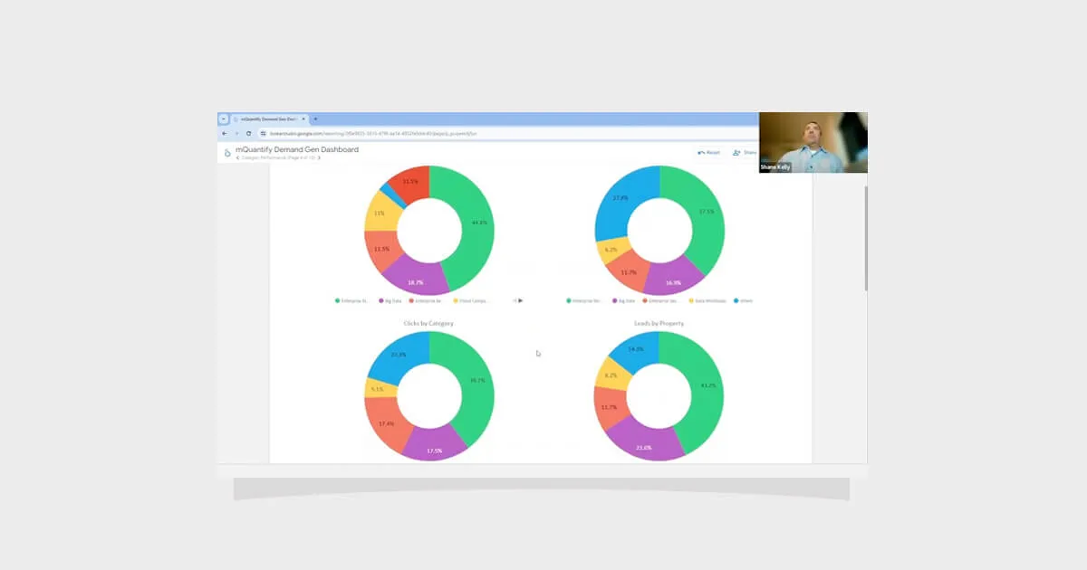
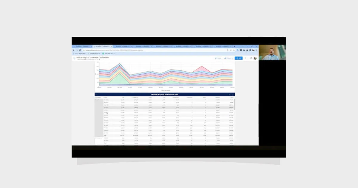
4. Pivot Tables for Summary Views
Often underestimated, pivot tables provide a powerful summary of metrics across categories. Incorporating hierarchical data allows for multi-level analysis in a single view.
For instance, a pivot table displaying weekly budget, actual spend, and remaining balance across marketing channels can instantly reveal areas of over- or underspending. This allows marketers to quickly adjust budget allocations and stay aligned with monthly performance goals.
5. Scatter Charts for Analyzing Relationships
Understanding the relationship between key metrics such as spend vs. ROAS or CPC vs. conversion rate is essential for developing effective campaign strategies and making informed budget decisions. A scatter chart is one of the best tools for this purpose.
By plotting two variables against each other, scatter charts help marketers quickly identify correlations, outliers, and performance clusters. This makes it easier to allocate more budget to high-performing campaigns and reduce spending on underperformers.
For example, a scatter plot showing ad spend on the x-axis and ROAS on the y-axis can instantly highlight performance outliers. A keyword positioned in the bottom-right corner—indicating high spend but low return—is typically a poor investment. In contrast, a keyword in the top-left corner—with low spend and high return—reflects a more efficient, high-performing opportunity.
Best Practices for Developing Effective Marketing Visualizations
Creating impactful visualizations isn’t just about aesthetics—it’s about clarity, accuracy, and usability. Here are some best practices:
1. Know Your Audience
Everyone interprets data differently. Executives often prefer high-level summaries that highlight key performance indicators and strategic outcomes, while analysts may require detailed breakdowns to explore trends and anomalies.
Engage stakeholders early in the process to understand their goals, decision-making needs, and preferred level of detail. This ensures your visualizations are not only informative but also relevant and actionable. Tailoring your visualizations to the user’s role enhances clarity, adoption, and business impact.
2. Choose the Right Chart Type
Each chart type serves a specific purpose, and selecting the right one is key to effectively communicating your message. For example:
- Bar charts are ideal for comparing performance across campaigns, channels, or regions.
- Line graphs are best for visualizing trends over time, such as changes in CPC or engagement rates.
- Scatter plots help analyze relationships between variables, like ad spend versus ROI.
While it may be tempting to use flashy visuals, clean and effective dashboards typically avoid overly complex or 3D charts, which can distort data and mislead interpretation.
3. Simplify and Declutter
Remove unnecessary elements like excessive gridlines or labels, and use whitespace to improve readability and focus attention on what matters most.
4. Use Color Intentionally
Color should guide the viewer’s attention. Stick to a consistent palette and use contrast to highlight key insights. Be mindful of accessibility for colorblind users.
5. Label Clearly
Always include clear axis labels, legends, and titles. Avoid jargon or abbreviations unless widely understood.
6. Provide Context
Numbers alone don’t tell the full story. Add annotations, benchmarks, or comparisons to help users interpret the data.
7. Design for All Screens
Ensure dashboards are responsive and optimized for desktop, tablet, and mobile devices so users can access insights anytime, anywhere.
8. Test and Iterate
Before finalizing, test your visualizations with real users. Ask: Is the message clear? Can it be understood without explanation?
Tools Powering the Transformation
Modern marketing teams rely on a variety of tools to bring their data to life. The right choice depends on your data complexity, budget, and reporting needs.
Here’s a quick comparison of some leading data visualization tools:
(You may want to add a table or bulleted list here for clarity.)
Looking Ahead: The Rise of AI-Powered Visualization
As AI evolves, expect more platforms to offer:
- Automated insights
- Predictive visualizations
- Natural language queries
For example, Power BI now integrates Copilot, allowing users to ask questions like “What caused the drop in engagement last week?” and receive instant visual answers. However, this feature requires a Microsoft Fabric Capacity (F2 or higher) or Power BI Premium Capacity (P1 or higher), which increases costs. It’s a worthwhile investment for teams managing complex analyses or multiple clients.
Final Thoughts
In a world where attention spans are short and data is abundant, visualization is the marketer’s secret weapon. It transforms noise into knowledge and empowers teams to act with confidence. For businesses aiming to stay competitive, investing in data visualization isn’t just smart—it’s essential.
Catch up on the entire From Data to Decisions series.
DISCUSS AI DISCLAIMER
This article was created and edited with the assistance of AI tools to ensure clarity, accuracy, and optimized structure for digital audiences.


From Data to Decisions: The Power of Visualization in Marketing Analytics
Download the guide to:
This is Part 4 of our “From Data to Decisions” series on building a modern marketing analytics engine. Previously, we explored strategy, measurement, and data engineering. Now, we look at how to transform data into clear, visual stories that drive action across your organization.
How Data Visualization Is Transforming Marketing Analytics
In today’s fast-paced digital landscape, marketing teams are inundated with data—from website traffic and social media engagement to email open rates and customer lifetime value. But raw data alone doesn’t drive decisions. The real power lies in how that data is interpreted and communicated. That’s where data visualization comes in—transforming complex datasets into clear, actionable insights.
Why Data Visualization Matters in Marketing
Marketing is no longer just about creativity; it’s about data-driven storytelling. Visualization bridges the gap between numbers and narratives, helping marketers:
- Spot trends and patterns quickly
- Communicate performance clearly to stakeholders
- Optimize budget allocation in real time
- Understand customer behavior at a glance
Whether it’s a bar chart showing top-performing markets, a KPI panel tracking month-over-month performance, or a line graph illustrating CPC trends, visual tools make it easier to see what’s working—and what’s not.
Essential Visualizations in Marketing Analytics
To turn raw marketing data into meaningful insights, it’s essential to use the right visuals. Effective data visualizations simplify complex information and make insights more accessible—especially for non-technical stakeholders. Below are some of the most common and impactful visualizations in marketing analytics:
1. KPI Performance Panels
Tracking key performance indicators is essential in every marketing project. A KPI panel at the top of a dashboard allows marketers and analysts to quickly review metrics like spend, clicks, CTR, CPC, and conversions. These panels can be configured for weekly, monthly, quarterly, or yearly views, often with comparisons to previous periods (e.g., MoM or YoY) for deeper insights.
By reviewing this KPI panel, analysts may observe that despite a nearly 10% reduction in spend month-over-month, both clicks and leads remained stable—indicating consistent performance. At the same time, cost efficiency improved, as shown by the decrease in CPC and CPL. However, the decline in CTR suggests a potential issue with ad creative or audience targeting, which may need to be revisited to maintain or boost engagement.
2. Bar Charts for Top and Bottom Performers
Bar charts are ideal for comparing performance across categories such as campaigns, channels, cities, or markets. They help marketers instantly identify top- or underperforming segments and adjust strategies accordingly.
The bar chart above clearly shows that Los Angeles generated the highest number of leads, while Birmingham had the fewest. This insight allows marketers to shift focus and investigate the Birmingham market more closely to identify what’s not working and uncover opportunities for improvement. Whether it’s a matter of targeting, messaging, or channel performance, this kind of visual helps guide strategic adjustments.
3. Line Graphs for Trend Analysis
Line graphs are perfect for tracking performance over time. They help marketers spot spikes, dips, or unusual patterns—critical for identifying issues and making timely adjustments.
By examining weekly CPC performance for three markets—Austin, Boston, and Cincinnati—marketers can easily track trends over time. The chart highlights key insights, such as a notable spike in CPC for Cincinnati in July, a drop in CPC for Austin in October, and a steady upward trend across all three markets from August through September. These patterns enable marketers to identify anomalies or shifts in performance and adjust strategies accordingly.
4. Pivot Tables for Summary Views
Often underestimated, pivot tables provide a powerful summary of metrics across categories. Incorporating hierarchical data allows for multi-level analysis in a single view.
For instance, a pivot table displaying weekly budget, actual spend, and remaining balance across marketing channels can instantly reveal areas of over- or underspending. This allows marketers to quickly adjust budget allocations and stay aligned with monthly performance goals.
5. Scatter Charts for Analyzing Relationships
Understanding the relationship between key metrics such as spend vs. ROAS or CPC vs. conversion rate is essential for developing effective campaign strategies and making informed budget decisions. A scatter chart is one of the best tools for this purpose.
By plotting two variables against each other, scatter charts help marketers quickly identify correlations, outliers, and performance clusters. This makes it easier to allocate more budget to high-performing campaigns and reduce spending on underperformers.
For example, a scatter plot showing ad spend on the x-axis and ROAS on the y-axis can instantly highlight performance outliers. A keyword positioned in the bottom-right corner—indicating high spend but low return—is typically a poor investment. In contrast, a keyword in the top-left corner—with low spend and high return—reflects a more efficient, high-performing opportunity.
Best Practices for Developing Effective Marketing Visualizations
Creating impactful visualizations isn’t just about aesthetics—it’s about clarity, accuracy, and usability. Here are some best practices:
1. Know Your Audience
Everyone interprets data differently. Executives often prefer high-level summaries that highlight key performance indicators and strategic outcomes, while analysts may require detailed breakdowns to explore trends and anomalies.
Engage stakeholders early in the process to understand their goals, decision-making needs, and preferred level of detail. This ensures your visualizations are not only informative but also relevant and actionable. Tailoring your visualizations to the user’s role enhances clarity, adoption, and business impact.
2. Choose the Right Chart Type
Each chart type serves a specific purpose, and selecting the right one is key to effectively communicating your message. For example:
- Bar charts are ideal for comparing performance across campaigns, channels, or regions.
- Line graphs are best for visualizing trends over time, such as changes in CPC or engagement rates.
- Scatter plots help analyze relationships between variables, like ad spend versus ROI.
While it may be tempting to use flashy visuals, clean and effective dashboards typically avoid overly complex or 3D charts, which can distort data and mislead interpretation.
3. Simplify and Declutter
Remove unnecessary elements like excessive gridlines or labels, and use whitespace to improve readability and focus attention on what matters most.
4. Use Color Intentionally
Color should guide the viewer’s attention. Stick to a consistent palette and use contrast to highlight key insights. Be mindful of accessibility for colorblind users.
5. Label Clearly
Always include clear axis labels, legends, and titles. Avoid jargon or abbreviations unless widely understood.
6. Provide Context
Numbers alone don’t tell the full story. Add annotations, benchmarks, or comparisons to help users interpret the data.
7. Design for All Screens
Ensure dashboards are responsive and optimized for desktop, tablet, and mobile devices so users can access insights anytime, anywhere.
8. Test and Iterate
Before finalizing, test your visualizations with real users. Ask: Is the message clear? Can it be understood without explanation?
Tools Powering the Transformation
Modern marketing teams rely on a variety of tools to bring their data to life. The right choice depends on your data complexity, budget, and reporting needs.
Here’s a quick comparison of some leading data visualization tools:
(You may want to add a table or bulleted list here for clarity.)
Looking Ahead: The Rise of AI-Powered Visualization
As AI evolves, expect more platforms to offer:
- Automated insights
- Predictive visualizations
- Natural language queries
For example, Power BI now integrates Copilot, allowing users to ask questions like “What caused the drop in engagement last week?” and receive instant visual answers. However, this feature requires a Microsoft Fabric Capacity (F2 or higher) or Power BI Premium Capacity (P1 or higher), which increases costs. It’s a worthwhile investment for teams managing complex analyses or multiple clients.
Final Thoughts
In a world where attention spans are short and data is abundant, visualization is the marketer’s secret weapon. It transforms noise into knowledge and empowers teams to act with confidence. For businesses aiming to stay competitive, investing in data visualization isn’t just smart—it’s essential.
Catch up on the entire From Data to Decisions series.
DISCUSS AI DISCLAIMER
This article was created and edited with the assistance of AI tools to ensure clarity, accuracy, and optimized structure for digital audiences.
From Data to Decisions: The Power of Visualization in Marketing Analytics
Key Insights From Our Research
This is Part 4 of our “From Data to Decisions” series on building a modern marketing analytics engine. Previously, we explored strategy, measurement, and data engineering. Now, we look at how to transform data into clear, visual stories that drive action across your organization.
How Data Visualization Is Transforming Marketing Analytics
In today’s fast-paced digital landscape, marketing teams are inundated with data—from website traffic and social media engagement to email open rates and customer lifetime value. But raw data alone doesn’t drive decisions. The real power lies in how that data is interpreted and communicated. That’s where data visualization comes in—transforming complex datasets into clear, actionable insights.
Why Data Visualization Matters in Marketing
Marketing is no longer just about creativity; it’s about data-driven storytelling. Visualization bridges the gap between numbers and narratives, helping marketers:
- Spot trends and patterns quickly
- Communicate performance clearly to stakeholders
- Optimize budget allocation in real time
- Understand customer behavior at a glance
Whether it’s a bar chart showing top-performing markets, a KPI panel tracking month-over-month performance, or a line graph illustrating CPC trends, visual tools make it easier to see what’s working—and what’s not.
Essential Visualizations in Marketing Analytics
To turn raw marketing data into meaningful insights, it’s essential to use the right visuals. Effective data visualizations simplify complex information and make insights more accessible—especially for non-technical stakeholders. Below are some of the most common and impactful visualizations in marketing analytics:
1. KPI Performance Panels
Tracking key performance indicators is essential in every marketing project. A KPI panel at the top of a dashboard allows marketers and analysts to quickly review metrics like spend, clicks, CTR, CPC, and conversions. These panels can be configured for weekly, monthly, quarterly, or yearly views, often with comparisons to previous periods (e.g., MoM or YoY) for deeper insights.
By reviewing this KPI panel, analysts may observe that despite a nearly 10% reduction in spend month-over-month, both clicks and leads remained stable—indicating consistent performance. At the same time, cost efficiency improved, as shown by the decrease in CPC and CPL. However, the decline in CTR suggests a potential issue with ad creative or audience targeting, which may need to be revisited to maintain or boost engagement.
2. Bar Charts for Top and Bottom Performers
Bar charts are ideal for comparing performance across categories such as campaigns, channels, cities, or markets. They help marketers instantly identify top- or underperforming segments and adjust strategies accordingly.
The bar chart above clearly shows that Los Angeles generated the highest number of leads, while Birmingham had the fewest. This insight allows marketers to shift focus and investigate the Birmingham market more closely to identify what’s not working and uncover opportunities for improvement. Whether it’s a matter of targeting, messaging, or channel performance, this kind of visual helps guide strategic adjustments.
3. Line Graphs for Trend Analysis
Line graphs are perfect for tracking performance over time. They help marketers spot spikes, dips, or unusual patterns—critical for identifying issues and making timely adjustments.
By examining weekly CPC performance for three markets—Austin, Boston, and Cincinnati—marketers can easily track trends over time. The chart highlights key insights, such as a notable spike in CPC for Cincinnati in July, a drop in CPC for Austin in October, and a steady upward trend across all three markets from August through September. These patterns enable marketers to identify anomalies or shifts in performance and adjust strategies accordingly.
4. Pivot Tables for Summary Views
Often underestimated, pivot tables provide a powerful summary of metrics across categories. Incorporating hierarchical data allows for multi-level analysis in a single view.
For instance, a pivot table displaying weekly budget, actual spend, and remaining balance across marketing channels can instantly reveal areas of over- or underspending. This allows marketers to quickly adjust budget allocations and stay aligned with monthly performance goals.
5. Scatter Charts for Analyzing Relationships
Understanding the relationship between key metrics such as spend vs. ROAS or CPC vs. conversion rate is essential for developing effective campaign strategies and making informed budget decisions. A scatter chart is one of the best tools for this purpose.
By plotting two variables against each other, scatter charts help marketers quickly identify correlations, outliers, and performance clusters. This makes it easier to allocate more budget to high-performing campaigns and reduce spending on underperformers.
For example, a scatter plot showing ad spend on the x-axis and ROAS on the y-axis can instantly highlight performance outliers. A keyword positioned in the bottom-right corner—indicating high spend but low return—is typically a poor investment. In contrast, a keyword in the top-left corner—with low spend and high return—reflects a more efficient, high-performing opportunity.
Best Practices for Developing Effective Marketing Visualizations
Creating impactful visualizations isn’t just about aesthetics—it’s about clarity, accuracy, and usability. Here are some best practices:
1. Know Your Audience
Everyone interprets data differently. Executives often prefer high-level summaries that highlight key performance indicators and strategic outcomes, while analysts may require detailed breakdowns to explore trends and anomalies.
Engage stakeholders early in the process to understand their goals, decision-making needs, and preferred level of detail. This ensures your visualizations are not only informative but also relevant and actionable. Tailoring your visualizations to the user’s role enhances clarity, adoption, and business impact.
2. Choose the Right Chart Type
Each chart type serves a specific purpose, and selecting the right one is key to effectively communicating your message. For example:
- Bar charts are ideal for comparing performance across campaigns, channels, or regions.
- Line graphs are best for visualizing trends over time, such as changes in CPC or engagement rates.
- Scatter plots help analyze relationships between variables, like ad spend versus ROI.
While it may be tempting to use flashy visuals, clean and effective dashboards typically avoid overly complex or 3D charts, which can distort data and mislead interpretation.
3. Simplify and Declutter
Remove unnecessary elements like excessive gridlines or labels, and use whitespace to improve readability and focus attention on what matters most.
4. Use Color Intentionally
Color should guide the viewer’s attention. Stick to a consistent palette and use contrast to highlight key insights. Be mindful of accessibility for colorblind users.
5. Label Clearly
Always include clear axis labels, legends, and titles. Avoid jargon or abbreviations unless widely understood.
6. Provide Context
Numbers alone don’t tell the full story. Add annotations, benchmarks, or comparisons to help users interpret the data.
7. Design for All Screens
Ensure dashboards are responsive and optimized for desktop, tablet, and mobile devices so users can access insights anytime, anywhere.
8. Test and Iterate
Before finalizing, test your visualizations with real users. Ask: Is the message clear? Can it be understood without explanation?
Tools Powering the Transformation
Modern marketing teams rely on a variety of tools to bring their data to life. The right choice depends on your data complexity, budget, and reporting needs.
Here’s a quick comparison of some leading data visualization tools:
(You may want to add a table or bulleted list here for clarity.)
Looking Ahead: The Rise of AI-Powered Visualization
As AI evolves, expect more platforms to offer:
- Automated insights
- Predictive visualizations
- Natural language queries
For example, Power BI now integrates Copilot, allowing users to ask questions like “What caused the drop in engagement last week?” and receive instant visual answers. However, this feature requires a Microsoft Fabric Capacity (F2 or higher) or Power BI Premium Capacity (P1 or higher), which increases costs. It’s a worthwhile investment for teams managing complex analyses or multiple clients.
Final Thoughts
In a world where attention spans are short and data is abundant, visualization is the marketer’s secret weapon. It transforms noise into knowledge and empowers teams to act with confidence. For businesses aiming to stay competitive, investing in data visualization isn’t just smart—it’s essential.
Catch up on the entire From Data to Decisions series.
DISCUSS AI DISCLAIMER
This article was created and edited with the assistance of AI tools to ensure clarity, accuracy, and optimized structure for digital audiences.
From Data to Decisions: The Power of Visualization in Marketing Analytics
Get the Complete Whitepaper
From Data to Decisions: The Power of Visualization in Marketing Analytics
This is Part 4 of our “From Data to Decisions” series on building a modern marketing analytics engine. Previously, we explored strategy, measurement, and data engineering. Now, we look at how to transform data into clear, visual stories that drive action across your organization.
How Data Visualization Is Transforming Marketing Analytics
In today’s fast-paced digital landscape, marketing teams are inundated with data—from website traffic and social media engagement to email open rates and customer lifetime value. But raw data alone doesn’t drive decisions. The real power lies in how that data is interpreted and communicated. That’s where data visualization comes in—transforming complex datasets into clear, actionable insights.
Why Data Visualization Matters in Marketing
Marketing is no longer just about creativity; it’s about data-driven storytelling. Visualization bridges the gap between numbers and narratives, helping marketers:
- Spot trends and patterns quickly
- Communicate performance clearly to stakeholders
- Optimize budget allocation in real time
- Understand customer behavior at a glance
Whether it’s a bar chart showing top-performing markets, a KPI panel tracking month-over-month performance, or a line graph illustrating CPC trends, visual tools make it easier to see what’s working—and what’s not.
Essential Visualizations in Marketing Analytics
To turn raw marketing data into meaningful insights, it’s essential to use the right visuals. Effective data visualizations simplify complex information and make insights more accessible—especially for non-technical stakeholders. Below are some of the most common and impactful visualizations in marketing analytics:
1. KPI Performance Panels
Tracking key performance indicators is essential in every marketing project. A KPI panel at the top of a dashboard allows marketers and analysts to quickly review metrics like spend, clicks, CTR, CPC, and conversions. These panels can be configured for weekly, monthly, quarterly, or yearly views, often with comparisons to previous periods (e.g., MoM or YoY) for deeper insights.
By reviewing this KPI panel, analysts may observe that despite a nearly 10% reduction in spend month-over-month, both clicks and leads remained stable—indicating consistent performance. At the same time, cost efficiency improved, as shown by the decrease in CPC and CPL. However, the decline in CTR suggests a potential issue with ad creative or audience targeting, which may need to be revisited to maintain or boost engagement.
2. Bar Charts for Top and Bottom Performers
Bar charts are ideal for comparing performance across categories such as campaigns, channels, cities, or markets. They help marketers instantly identify top- or underperforming segments and adjust strategies accordingly.
The bar chart above clearly shows that Los Angeles generated the highest number of leads, while Birmingham had the fewest. This insight allows marketers to shift focus and investigate the Birmingham market more closely to identify what’s not working and uncover opportunities for improvement. Whether it’s a matter of targeting, messaging, or channel performance, this kind of visual helps guide strategic adjustments.
3. Line Graphs for Trend Analysis
Line graphs are perfect for tracking performance over time. They help marketers spot spikes, dips, or unusual patterns—critical for identifying issues and making timely adjustments.
By examining weekly CPC performance for three markets—Austin, Boston, and Cincinnati—marketers can easily track trends over time. The chart highlights key insights, such as a notable spike in CPC for Cincinnati in July, a drop in CPC for Austin in October, and a steady upward trend across all three markets from August through September. These patterns enable marketers to identify anomalies or shifts in performance and adjust strategies accordingly.
4. Pivot Tables for Summary Views
Often underestimated, pivot tables provide a powerful summary of metrics across categories. Incorporating hierarchical data allows for multi-level analysis in a single view.
For instance, a pivot table displaying weekly budget, actual spend, and remaining balance across marketing channels can instantly reveal areas of over- or underspending. This allows marketers to quickly adjust budget allocations and stay aligned with monthly performance goals.
5. Scatter Charts for Analyzing Relationships
Understanding the relationship between key metrics such as spend vs. ROAS or CPC vs. conversion rate is essential for developing effective campaign strategies and making informed budget decisions. A scatter chart is one of the best tools for this purpose.
By plotting two variables against each other, scatter charts help marketers quickly identify correlations, outliers, and performance clusters. This makes it easier to allocate more budget to high-performing campaigns and reduce spending on underperformers.
For example, a scatter plot showing ad spend on the x-axis and ROAS on the y-axis can instantly highlight performance outliers. A keyword positioned in the bottom-right corner—indicating high spend but low return—is typically a poor investment. In contrast, a keyword in the top-left corner—with low spend and high return—reflects a more efficient, high-performing opportunity.
Best Practices for Developing Effective Marketing Visualizations
Creating impactful visualizations isn’t just about aesthetics—it’s about clarity, accuracy, and usability. Here are some best practices:
1. Know Your Audience
Everyone interprets data differently. Executives often prefer high-level summaries that highlight key performance indicators and strategic outcomes, while analysts may require detailed breakdowns to explore trends and anomalies.
Engage stakeholders early in the process to understand their goals, decision-making needs, and preferred level of detail. This ensures your visualizations are not only informative but also relevant and actionable. Tailoring your visualizations to the user’s role enhances clarity, adoption, and business impact.
2. Choose the Right Chart Type
Each chart type serves a specific purpose, and selecting the right one is key to effectively communicating your message. For example:
- Bar charts are ideal for comparing performance across campaigns, channels, or regions.
- Line graphs are best for visualizing trends over time, such as changes in CPC or engagement rates.
- Scatter plots help analyze relationships between variables, like ad spend versus ROI.
While it may be tempting to use flashy visuals, clean and effective dashboards typically avoid overly complex or 3D charts, which can distort data and mislead interpretation.
3. Simplify and Declutter
Remove unnecessary elements like excessive gridlines or labels, and use whitespace to improve readability and focus attention on what matters most.
4. Use Color Intentionally
Color should guide the viewer’s attention. Stick to a consistent palette and use contrast to highlight key insights. Be mindful of accessibility for colorblind users.
5. Label Clearly
Always include clear axis labels, legends, and titles. Avoid jargon or abbreviations unless widely understood.
6. Provide Context
Numbers alone don’t tell the full story. Add annotations, benchmarks, or comparisons to help users interpret the data.
7. Design for All Screens
Ensure dashboards are responsive and optimized for desktop, tablet, and mobile devices so users can access insights anytime, anywhere.
8. Test and Iterate
Before finalizing, test your visualizations with real users. Ask: Is the message clear? Can it be understood without explanation?
Tools Powering the Transformation
Modern marketing teams rely on a variety of tools to bring their data to life. The right choice depends on your data complexity, budget, and reporting needs.
Here’s a quick comparison of some leading data visualization tools:
(You may want to add a table or bulleted list here for clarity.)
Looking Ahead: The Rise of AI-Powered Visualization
As AI evolves, expect more platforms to offer:
- Automated insights
- Predictive visualizations
- Natural language queries
For example, Power BI now integrates Copilot, allowing users to ask questions like “What caused the drop in engagement last week?” and receive instant visual answers. However, this feature requires a Microsoft Fabric Capacity (F2 or higher) or Power BI Premium Capacity (P1 or higher), which increases costs. It’s a worthwhile investment for teams managing complex analyses or multiple clients.
Final Thoughts
In a world where attention spans are short and data is abundant, visualization is the marketer’s secret weapon. It transforms noise into knowledge and empowers teams to act with confidence. For businesses aiming to stay competitive, investing in data visualization isn’t just smart—it’s essential.
Catch up on the entire From Data to Decisions series.
DISCUSS AI DISCLAIMER
This article was created and edited with the assistance of AI tools to ensure clarity, accuracy, and optimized structure for digital audiences.
From Data to Decisions: The Power of Visualization in Marketing Analytics
Get the Slides


From Data to Decisions: The Power of Visualization in Marketing Analytics
This is Part 4 of our “From Data to Decisions” series on building a modern marketing analytics engine. Previously, we explored strategy, measurement, and data engineering. Now, we look at how to transform data into clear, visual stories that drive action across your organization.
How Data Visualization Is Transforming Marketing Analytics
In today’s fast-paced digital landscape, marketing teams are inundated with data—from website traffic and social media engagement to email open rates and customer lifetime value. But raw data alone doesn’t drive decisions. The real power lies in how that data is interpreted and communicated. That’s where data visualization comes in—transforming complex datasets into clear, actionable insights.
Why Data Visualization Matters in Marketing
Marketing is no longer just about creativity; it’s about data-driven storytelling. Visualization bridges the gap between numbers and narratives, helping marketers:
- Spot trends and patterns quickly
- Communicate performance clearly to stakeholders
- Optimize budget allocation in real time
- Understand customer behavior at a glance
Whether it’s a bar chart showing top-performing markets, a KPI panel tracking month-over-month performance, or a line graph illustrating CPC trends, visual tools make it easier to see what’s working—and what’s not.
Essential Visualizations in Marketing Analytics
To turn raw marketing data into meaningful insights, it’s essential to use the right visuals. Effective data visualizations simplify complex information and make insights more accessible—especially for non-technical stakeholders. Below are some of the most common and impactful visualizations in marketing analytics:
1. KPI Performance Panels
Tracking key performance indicators is essential in every marketing project. A KPI panel at the top of a dashboard allows marketers and analysts to quickly review metrics like spend, clicks, CTR, CPC, and conversions. These panels can be configured for weekly, monthly, quarterly, or yearly views, often with comparisons to previous periods (e.g., MoM or YoY) for deeper insights.
By reviewing this KPI panel, analysts may observe that despite a nearly 10% reduction in spend month-over-month, both clicks and leads remained stable—indicating consistent performance. At the same time, cost efficiency improved, as shown by the decrease in CPC and CPL. However, the decline in CTR suggests a potential issue with ad creative or audience targeting, which may need to be revisited to maintain or boost engagement.
2. Bar Charts for Top and Bottom Performers
Bar charts are ideal for comparing performance across categories such as campaigns, channels, cities, or markets. They help marketers instantly identify top- or underperforming segments and adjust strategies accordingly.
The bar chart above clearly shows that Los Angeles generated the highest number of leads, while Birmingham had the fewest. This insight allows marketers to shift focus and investigate the Birmingham market more closely to identify what’s not working and uncover opportunities for improvement. Whether it’s a matter of targeting, messaging, or channel performance, this kind of visual helps guide strategic adjustments.
3. Line Graphs for Trend Analysis
Line graphs are perfect for tracking performance over time. They help marketers spot spikes, dips, or unusual patterns—critical for identifying issues and making timely adjustments.
By examining weekly CPC performance for three markets—Austin, Boston, and Cincinnati—marketers can easily track trends over time. The chart highlights key insights, such as a notable spike in CPC for Cincinnati in July, a drop in CPC for Austin in October, and a steady upward trend across all three markets from August through September. These patterns enable marketers to identify anomalies or shifts in performance and adjust strategies accordingly.
4. Pivot Tables for Summary Views
Often underestimated, pivot tables provide a powerful summary of metrics across categories. Incorporating hierarchical data allows for multi-level analysis in a single view.
For instance, a pivot table displaying weekly budget, actual spend, and remaining balance across marketing channels can instantly reveal areas of over- or underspending. This allows marketers to quickly adjust budget allocations and stay aligned with monthly performance goals.
5. Scatter Charts for Analyzing Relationships
Understanding the relationship between key metrics such as spend vs. ROAS or CPC vs. conversion rate is essential for developing effective campaign strategies and making informed budget decisions. A scatter chart is one of the best tools for this purpose.
By plotting two variables against each other, scatter charts help marketers quickly identify correlations, outliers, and performance clusters. This makes it easier to allocate more budget to high-performing campaigns and reduce spending on underperformers.
For example, a scatter plot showing ad spend on the x-axis and ROAS on the y-axis can instantly highlight performance outliers. A keyword positioned in the bottom-right corner—indicating high spend but low return—is typically a poor investment. In contrast, a keyword in the top-left corner—with low spend and high return—reflects a more efficient, high-performing opportunity.
Best Practices for Developing Effective Marketing Visualizations
Creating impactful visualizations isn’t just about aesthetics—it’s about clarity, accuracy, and usability. Here are some best practices:
1. Know Your Audience
Everyone interprets data differently. Executives often prefer high-level summaries that highlight key performance indicators and strategic outcomes, while analysts may require detailed breakdowns to explore trends and anomalies.
Engage stakeholders early in the process to understand their goals, decision-making needs, and preferred level of detail. This ensures your visualizations are not only informative but also relevant and actionable. Tailoring your visualizations to the user’s role enhances clarity, adoption, and business impact.
2. Choose the Right Chart Type
Each chart type serves a specific purpose, and selecting the right one is key to effectively communicating your message. For example:
- Bar charts are ideal for comparing performance across campaigns, channels, or regions.
- Line graphs are best for visualizing trends over time, such as changes in CPC or engagement rates.
- Scatter plots help analyze relationships between variables, like ad spend versus ROI.
While it may be tempting to use flashy visuals, clean and effective dashboards typically avoid overly complex or 3D charts, which can distort data and mislead interpretation.
3. Simplify and Declutter
Remove unnecessary elements like excessive gridlines or labels, and use whitespace to improve readability and focus attention on what matters most.
4. Use Color Intentionally
Color should guide the viewer’s attention. Stick to a consistent palette and use contrast to highlight key insights. Be mindful of accessibility for colorblind users.
5. Label Clearly
Always include clear axis labels, legends, and titles. Avoid jargon or abbreviations unless widely understood.
6. Provide Context
Numbers alone don’t tell the full story. Add annotations, benchmarks, or comparisons to help users interpret the data.
7. Design for All Screens
Ensure dashboards are responsive and optimized for desktop, tablet, and mobile devices so users can access insights anytime, anywhere.
8. Test and Iterate
Before finalizing, test your visualizations with real users. Ask: Is the message clear? Can it be understood without explanation?
Tools Powering the Transformation
Modern marketing teams rely on a variety of tools to bring their data to life. The right choice depends on your data complexity, budget, and reporting needs.
Here’s a quick comparison of some leading data visualization tools:
(You may want to add a table or bulleted list here for clarity.)
Looking Ahead: The Rise of AI-Powered Visualization
As AI evolves, expect more platforms to offer:
- Automated insights
- Predictive visualizations
- Natural language queries
For example, Power BI now integrates Copilot, allowing users to ask questions like “What caused the drop in engagement last week?” and receive instant visual answers. However, this feature requires a Microsoft Fabric Capacity (F2 or higher) or Power BI Premium Capacity (P1 or higher), which increases costs. It’s a worthwhile investment for teams managing complex analyses or multiple clients.
Final Thoughts
In a world where attention spans are short and data is abundant, visualization is the marketer’s secret weapon. It transforms noise into knowledge and empowers teams to act with confidence. For businesses aiming to stay competitive, investing in data visualization isn’t just smart—it’s essential.
Catch up on the entire From Data to Decisions series.
DISCUSS AI DISCLAIMER
This article was created and edited with the assistance of AI tools to ensure clarity, accuracy, and optimized structure for digital audiences.
From Data to Decisions: The Power of Visualization in Marketing Analytics