


Google’s Mobile-First Index
As of November 2017, Google will now have one index for its search results and will index the mobile-version of your website before the desktop-version. (Google had typically used the desktop version of a page’s content to index and determine rankings for a page.)
How your website renders on a mobile device is now the primary indicator on what pages are indexed and how your website ranks in Google’s Search Results. If you have pages that are not mobile-friendly, Google will still index the desktop version but you could miss ranking benefits for each page that is not mobile-friendly. Mobile friendliness has always been a positive ranking factor, but this roll-out is Google’s push to make their search results more mobile-friendly.
Recent Update
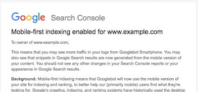
As of March 26th, 2018, Google is only migrating individual sites that follow best practices for mobile-first indexing. A handful of websites have received this message; you should expect a message if your website complies with Google Best Practices for Mobile Indexing (see last page).
Accelerated Mobile Pages (AMP)
For sites that have AMP and non-AMP pages, Google will prefer to index the mobile version of the non-AMP page.
Improve Your Mobile Rankings
Mobile-friendly pages that load fast tend to rank better than non-mobile friendly pages in Google’s Search Results, since they provide a better user experience for mobile searchers.
- Already have a Mobile-Friendly Website?
- Continue to improve the page speed and user experience of your existing, mobile-friendly website.
- Don’t have a Mobile-Friendly Website or Partially Mobile-Friendly?
- Speak with your SEO team and web developer about mobile configuration types you can choose to make your website mobile-friendly.
Next Steps
- Analyze the percentage of traffic (and user engagement metrics) from mobile devices to your website to understand the importance of a responsive, fast-loading mobile site.
- Manually check how your Homepage and High-Priority Pages look on popular mobile devices (based on traffic by device type).
- Visit Google’s Mobile-Friendly Test to see if your homepage and high-priority pages are mobile-friendly.
- Visit the “Fetch (and Render) as Google” section in your Google Search Console and submit your homepage and high-priority pages to understand how Google views each page’s content.
- Visit PageSpeed Insights to review the PageSpeed of your Homepage and High-Priority Pages.
- Review Google’s Best Practice for Mobile-First Indexing on the next page.